PORTFOLIO

74 - Typeface
Case Study
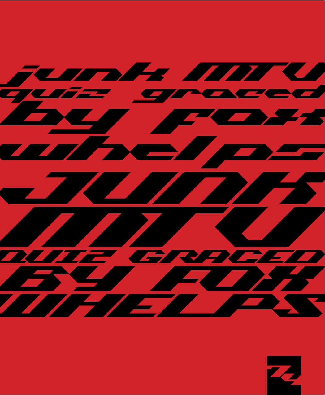
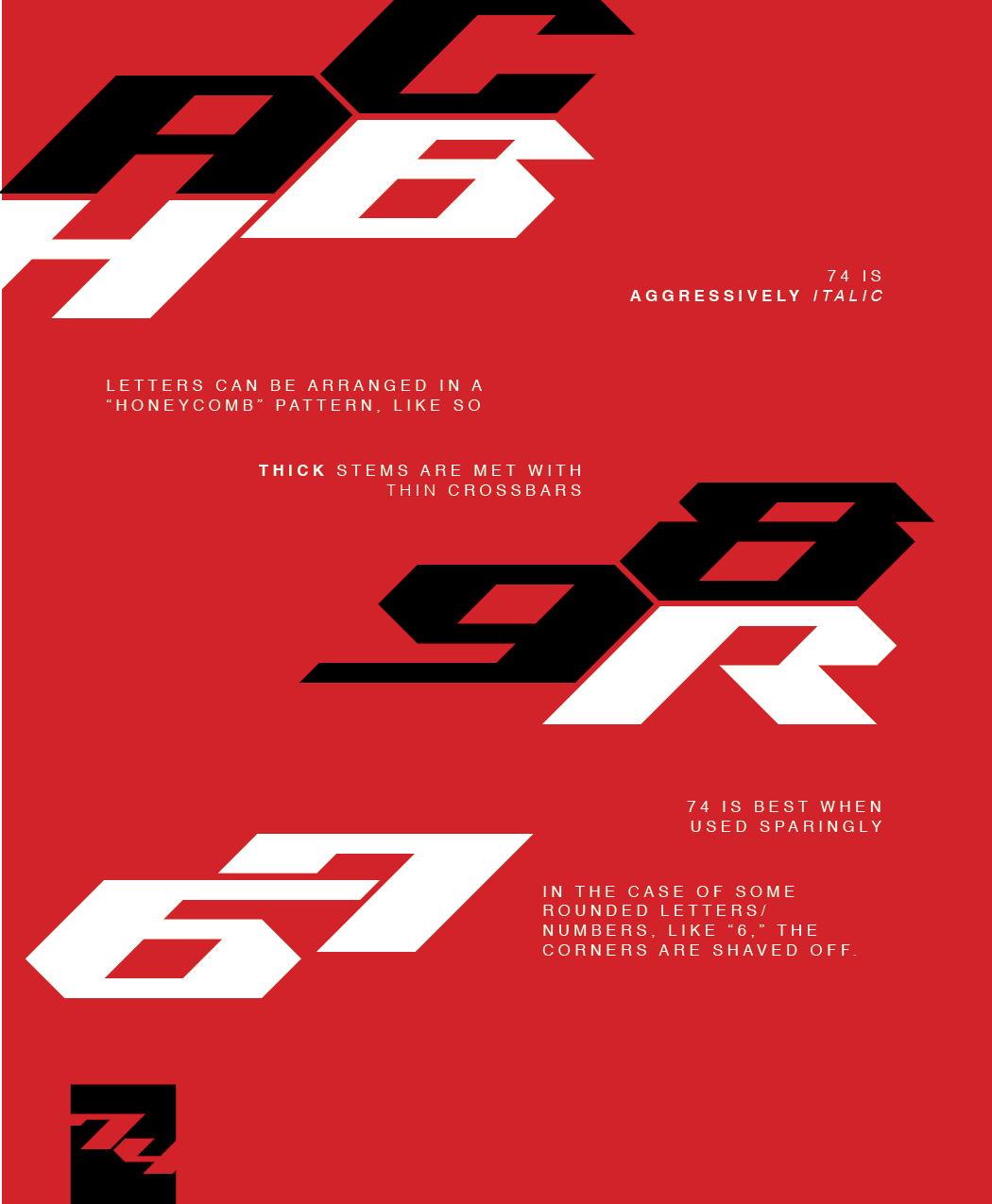
I created 74, a typeface, in the Fall of 2025 for a typography class. The project was based around the complete process of creating our own usable font, from sketching out ideas on paper all the way to digitizing the fonts so they could be used digitally. With my font, 74, I went for an edgier feel——I wanted it to look like something you'd see on the side of a racecar or something. Below, you can look at the different steps of the process and see how my idea evolved into its final form.
Sketching
step one
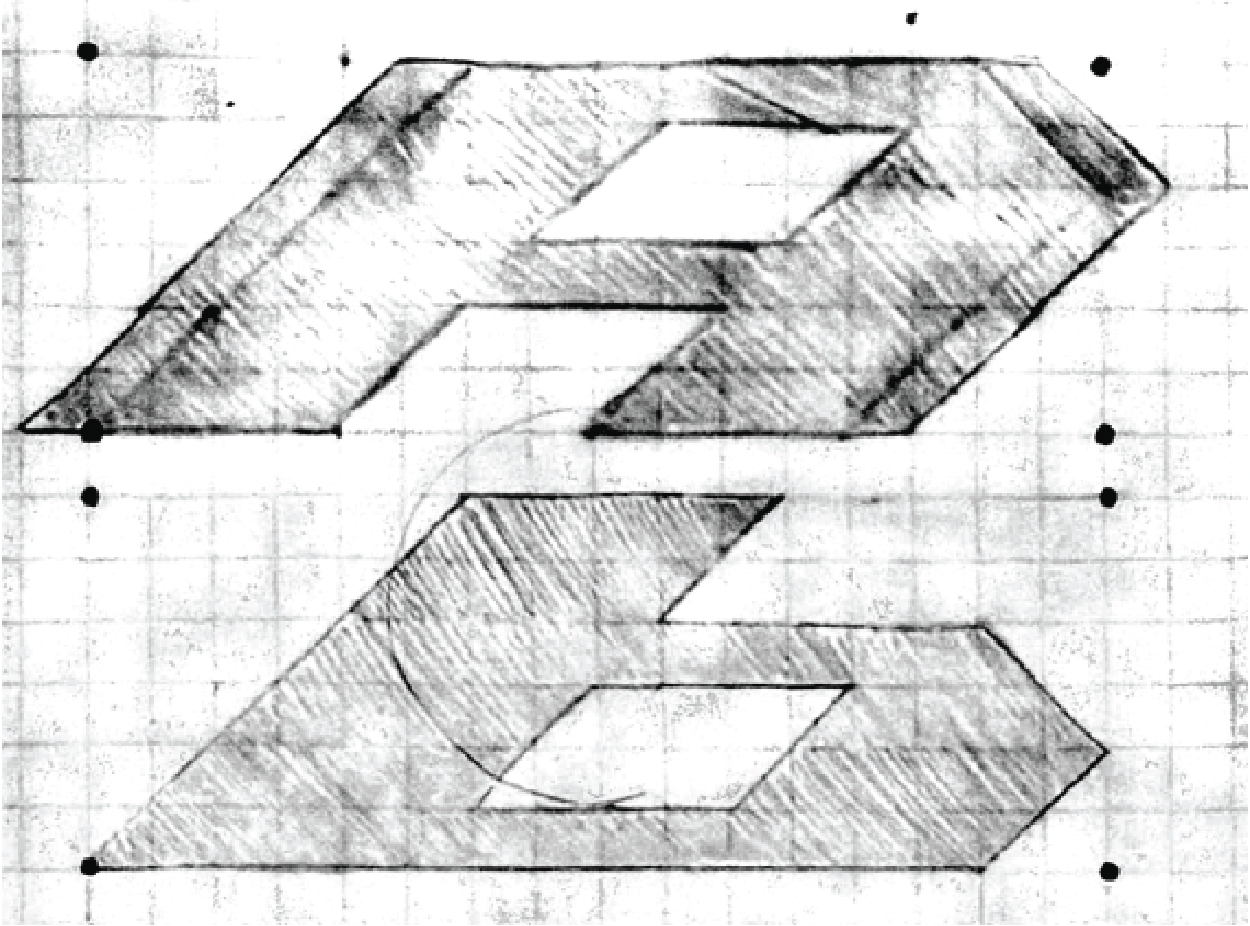
The process began, as per usual, in the sketchbook. We were tasked with sketching out "HOMRA's" for 5-6 different potential typefaces. The name HOMRA comes from the fact that you aren't sketching out the whole alphabet for each typeface, just the letters H, O, M, R, and A. After sifting through all my sketches, I decided to move forward with the one that would end up being 74, and drew out the rest of the alphabet on paper.
Digitization
step two
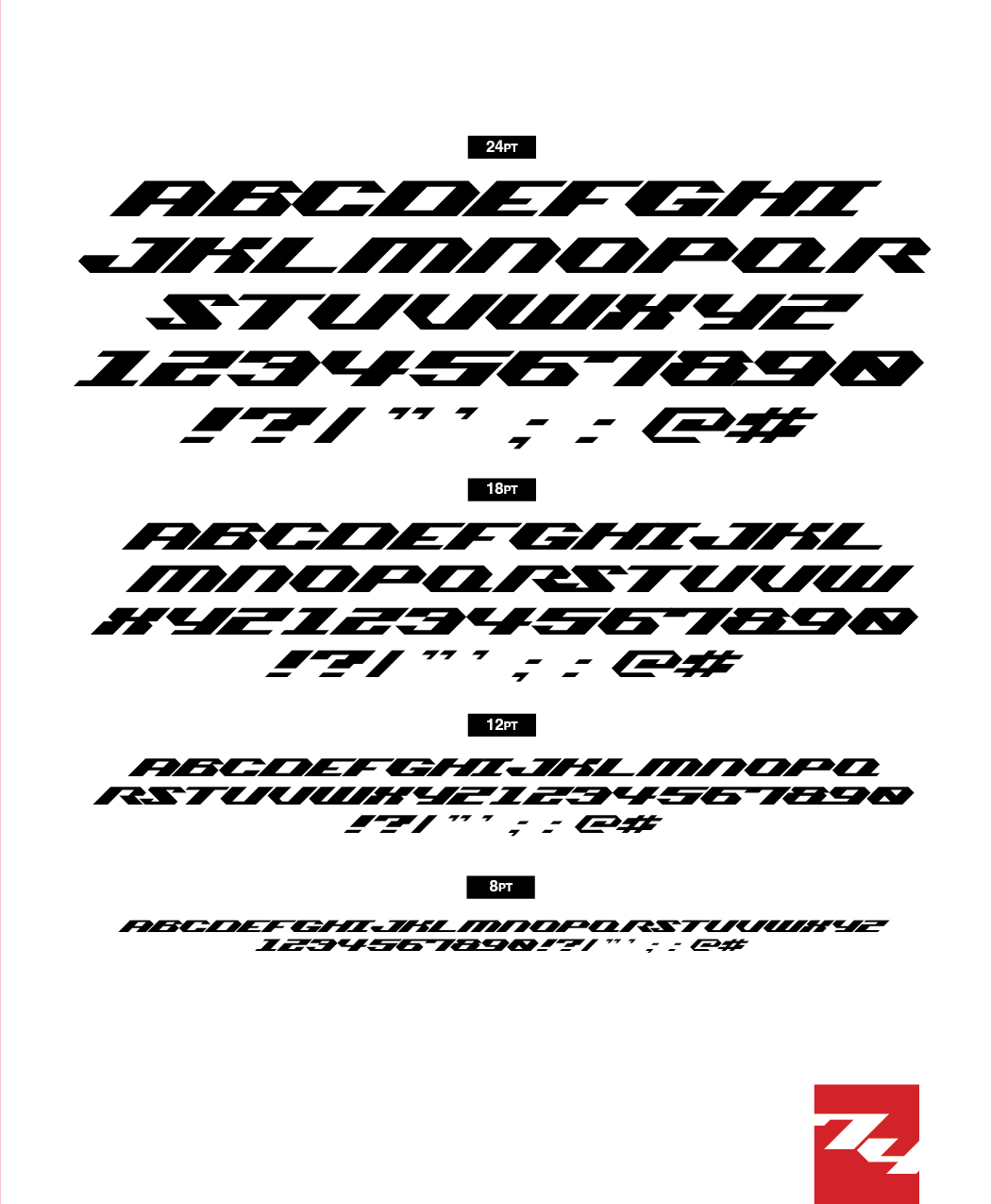
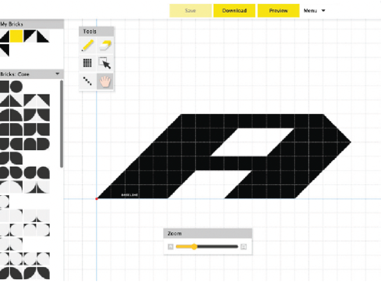
Once I had created the whole alphabet for the typeface, it was time to move to digitization. This process incolved recreating the font in a grid structure on fontstruct.com. I ended up adding lowercase to the typeface at this stage, since it seemed to come easily.
Text Specimen
step three
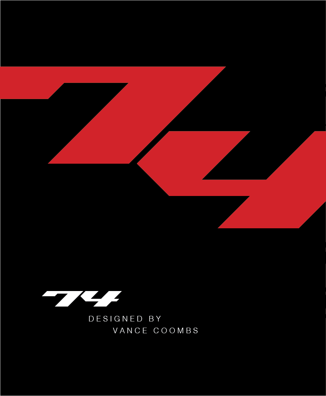
Now that I had the whole font in digital form, I was able to move forward. The next step of the assignment was to create a "type specimen," which is essentially a small, concise paper booklet that showcases the typeface and how it could be used. It was at this stage that I decided on the name "74", simply because I thought the font looked best when used on short words or numbers.
I created the specimen entirely in InDesign, with each page being 5 x 6 inches. I decided to stick to using only two print colors, red and black, for the booklet, so as not to draw any attention away from the typeface itself. When the booklet was completed in InDesign, I printed it out.
Final Product